10 effective ways to increase engagement during user onboarding
Investing in an effective onboarding process is a must for every company. It helps users experience the value of your product and reaffirms that they made the right decision.
However, many companies continue to fall short of buyer expectations. In fact, as many as 90% of consumers feel that companies “could do better” when it comes to user onboarding. If your company is struggling with retaining buyers, the problem may be your onboarding process.
In this article, we’ll look at user onboarding best practices that help create an effective onboarding experience and increase engagement.
JUMP TO EACH SECTION TO SEE BEST PRACTICES (WITH EXAMPLES):
1. Create a frictionless signup process
It’s important to make the signup process as effortless as possible.
If you’re experiencing a high drop-off rate — the percentage of users who start signing up but don’t complete the process — you’re probably asking for too much information upfront.
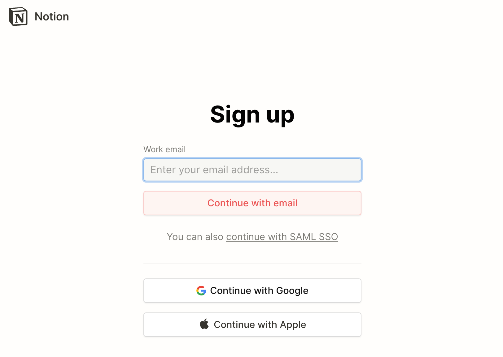
Here’s a good example of a frictionless signup page from Notion, a productivity and collaboration tool:
Notion only asks for your email address. You can also continue with a Google or Apple email address.
Experiment with your signup form and measure your drop-off rate. Even a simple change, like adding a new authentication option, can lead to more signups.
Signup process best practices:
- Keep your forms as short as possible: The more information you require, the more friction you introduce. Only ask for information you absolutely need.
- Include other signup options: Some users may prefer to use services that they already use. Make sure to include other sign-in options, like Apple, Google, or Slack.
2. Send a welcome email to new users
The fact that a buyer has signed up for your product doesn’t mean you’ve sealed the deal. The buyer is still evaluating your company and could churn if your solution doesn’t deliver value.
An effective welcome email can set the tone for your brand and reduce the time to value — the amount of time it takes for new buyers to derive value from your solution.
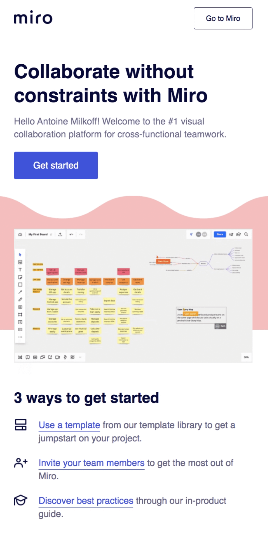
Here’s an example of a welcome email that Miro, a collaborative whiteboard platform, sends to new users:
First, it welcomes the new user by name. Then it reiterates its value proposition (“Collaborate without constraints”) to reassure the user of their decision. Finally, it provides a short list of next steps for the user to take.
Welcome email product onboarding best practices:
- Add links to helpful resources: No matter how intuitive your product is, users need guidance on how to use it. Include links to resources like product tours, knowledge bases, and FAQ pages.
- Add a call to action (CTA): The main goal of a welcome email is to get users to log in to your product and start using it right away. Include a prominent CTA button or link that directs users back to your product.
3. Deliver personalized user onboarding journeys
71% of consumers expect brands to deliver personalized interactions. What’s more, 76% of consumers get frustrated when companies fail to meet those expectations.
Every user has different needs, so it doesn’t make sense to lead every user down the same onboarding path. Delivering personalized onboarding journeys helps you increase engagement and exceed users’ expectations.
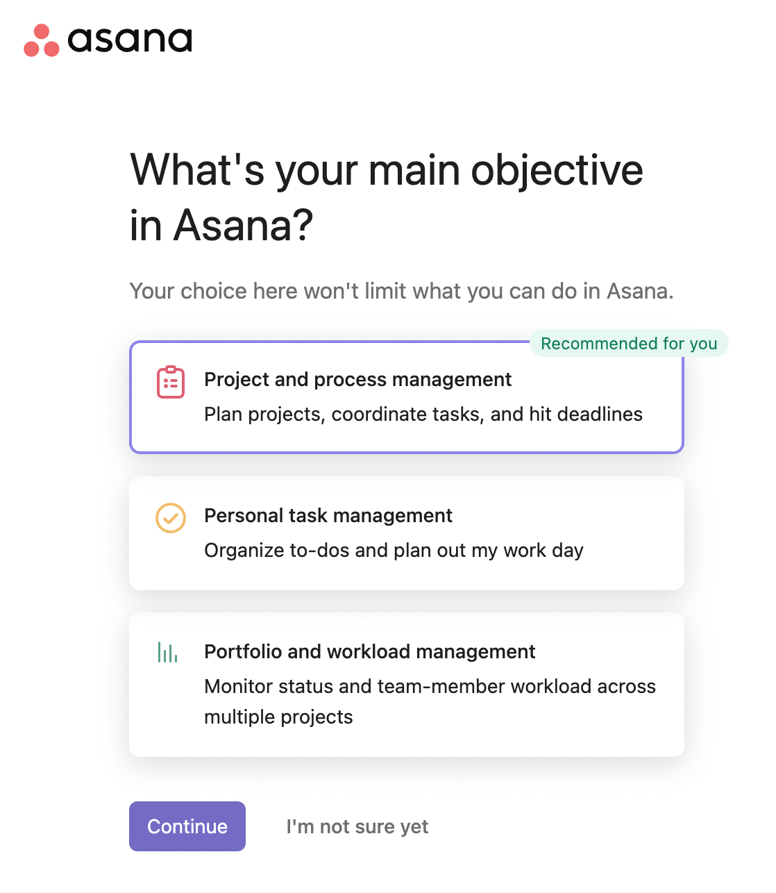
When a user first signs up for Asana, a project management tool, they’re asked what their role is and the kind of work they do. Then, the tool asks them what their main objectives are.
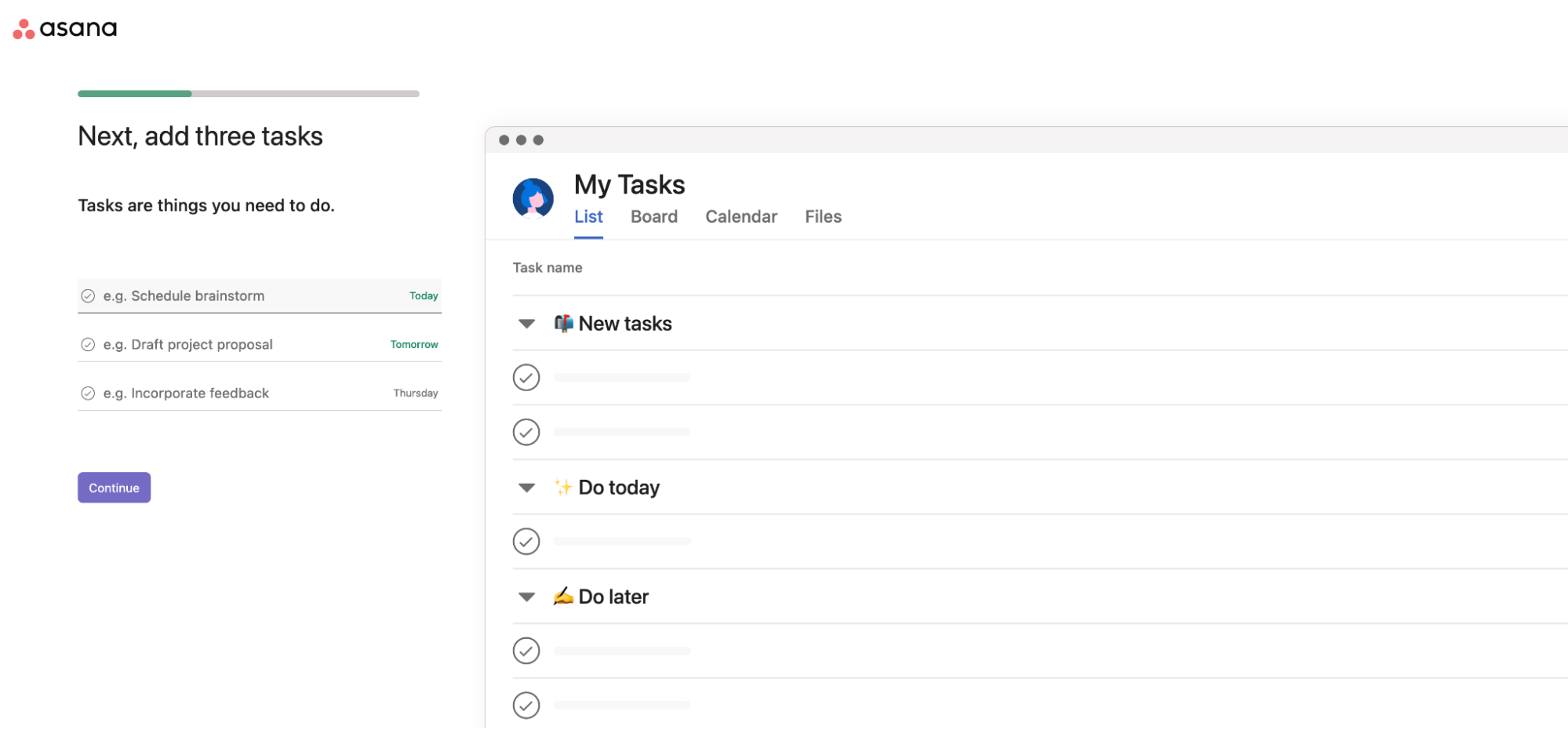
Asana personalizes the rest of the onboarding journey based on the user’s selection. If they select “Personal task management,” they’ll be taken straight to a page where they can start adding a list of tasks.
Examine your buyer personas and consider how each might use your platform. Then, offer personalized onboarding journeys that enable each persona to achieve specific objectives. You can also create journeys based on specific roles or different departments (finance, sales, human resources, etc.).
Personalization best practices:
- Don’t overwhelm your users: Give users the flexibility to choose their own onboarding journey. But take care not to provide too many options, as that could add friction to your onboarding process.
- Give users the option to skip: If you’re letting users self-select their path after signing up, make sure to include a “skip” button.
4. Identify your product’s “aha” moment
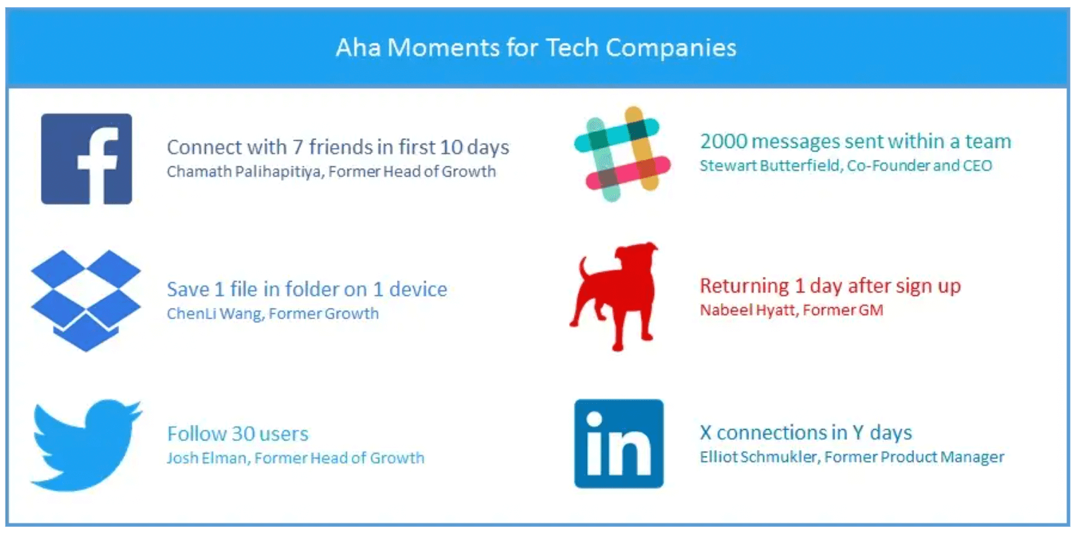
In the early days of Facebook, the growth team discovered that users who added at least 7 friends within the first 10 days were more likely to stick around than those who didn’t.
These are known as “aha” moments — when a new user first derives value from your product. An “aha” moment can be as simple as creating a checklist or as complex as building a workflow. Getting users to complete these actions is key to increasing retention.
Here are other examples of “aha” moments for different tech companies:
What sets retained users apart from those who have churned?
Look through your analytics, note any patterns in behavioral data, and hone in on the specific actions that correlate to buyer retention. Then, optimize your onboarding process to guide users to those actions as quickly as possible.
Best practices for finding your product’s “aha” moments:
- Supplement with user feedback: Reach out to your top users and ask if they’re willing to share qualitative feedback with you. Analyze this feedback and look for any patterns that stand out. Are there specific features users interact with?
- Put your theories to the test: Use tools like User Pilot or Appcues to create and test onboarding experiences that guide your users to their “aha” moments. The results will help you determine whether certain behaviors impact long-term engagement.
5. Create a helpful empty state
One way to enhance the onboarding experience and help users get to that crucial “aha” moment as early as possible is to fill your empty state with helpful information.
An empty state is a blank space users see when they first log in to a product. These pages typically don’t have any activities since it’s the user’s first time using the product.
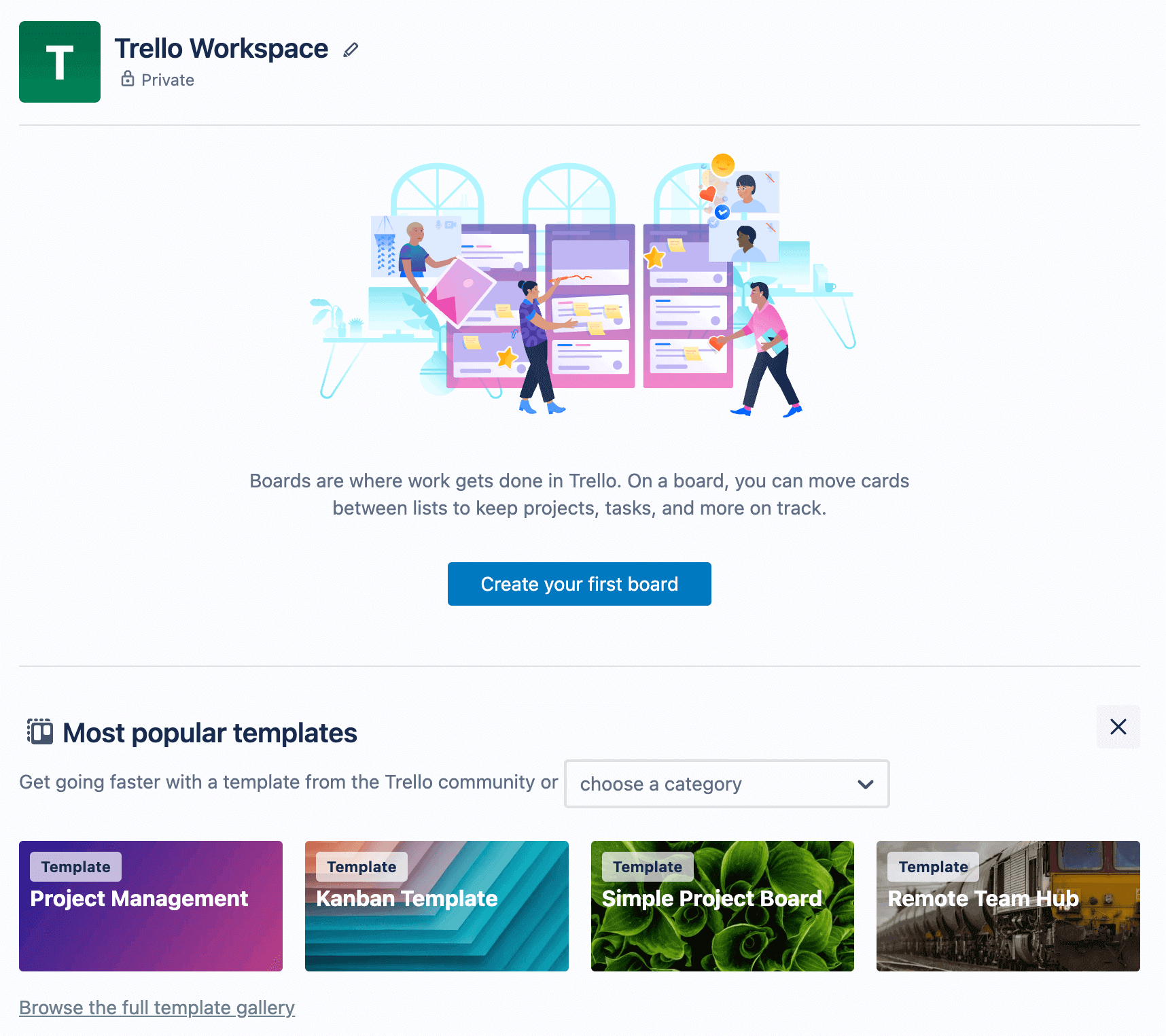
Trello, a kanban-style project management tool, shows a helpful empty state when users first log in to the platform.
Right away, Trello provides a brief description of what boards are and includes a link for users to create their first one. There’s also a list of popular templates that users can get started with.
Here’s an example of a project management template:
Each card provides a handy tip to help users learn about different features.
Empty state best practices:
- Provide an action step: Don’t just present users with a completely empty state. Give directions on what they should do next (create a board, add a team member, etc.). However, keep these actions to a minimum — one or two at most.
- Include starter content: Seeing a state with no information can overwhelm your users. Fill your empty state with helpful starter content.
6. Use interactive product tours
The downside of walkthrough videos is that they’re passive — users simply watch a video, barely interacting with the product. By the time they finish, they may forget where certain features are or how they work.
A better way to create an engaging onboarding experience (and make it an active learning process) is by using an interactive product tour. These typically include tooltips and popups that point out different areas of an interface.
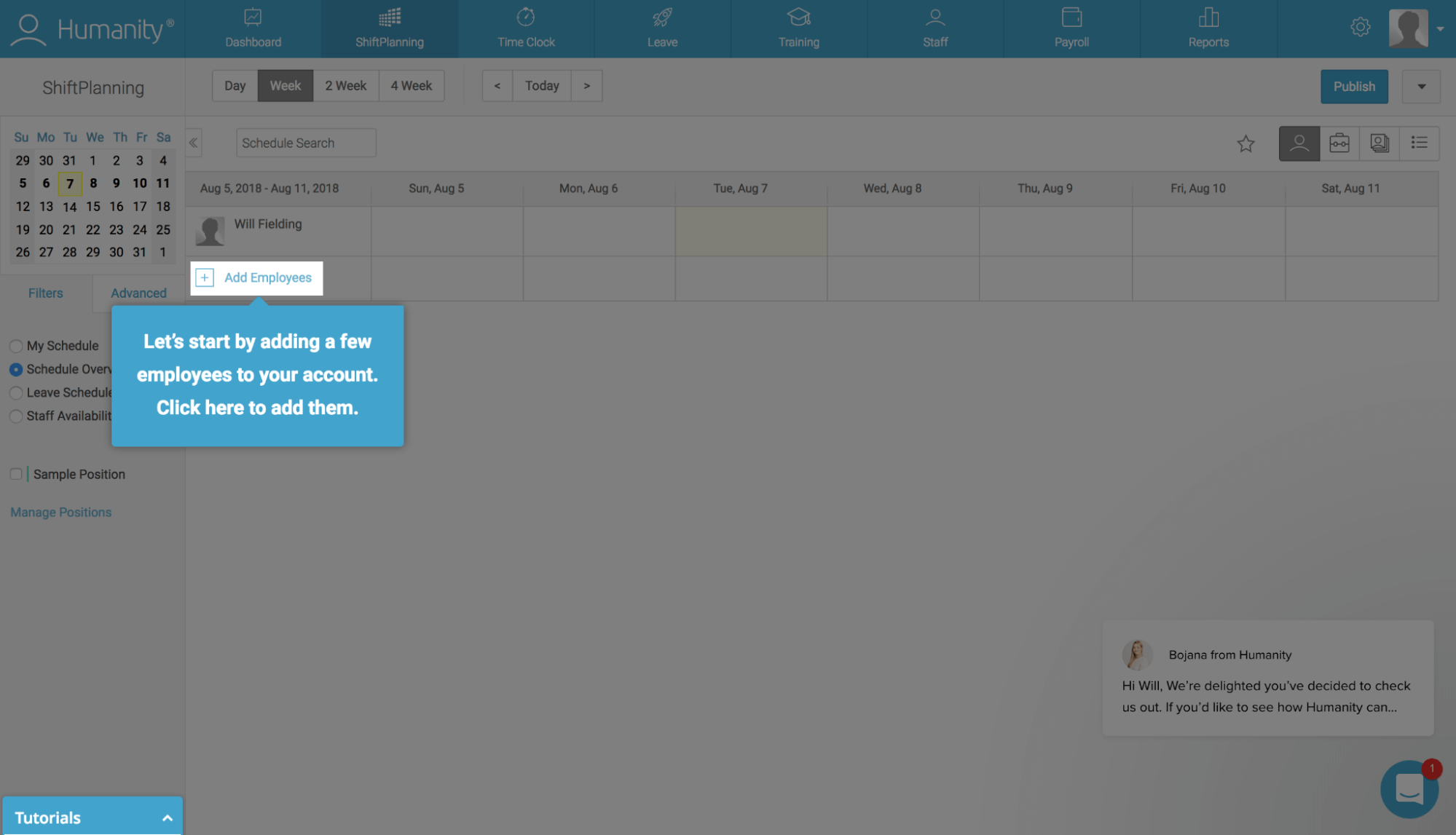
Humanity, an employee scheduling software, provides action-driven tooltips that guide users toward specific actions (like adding new employees).
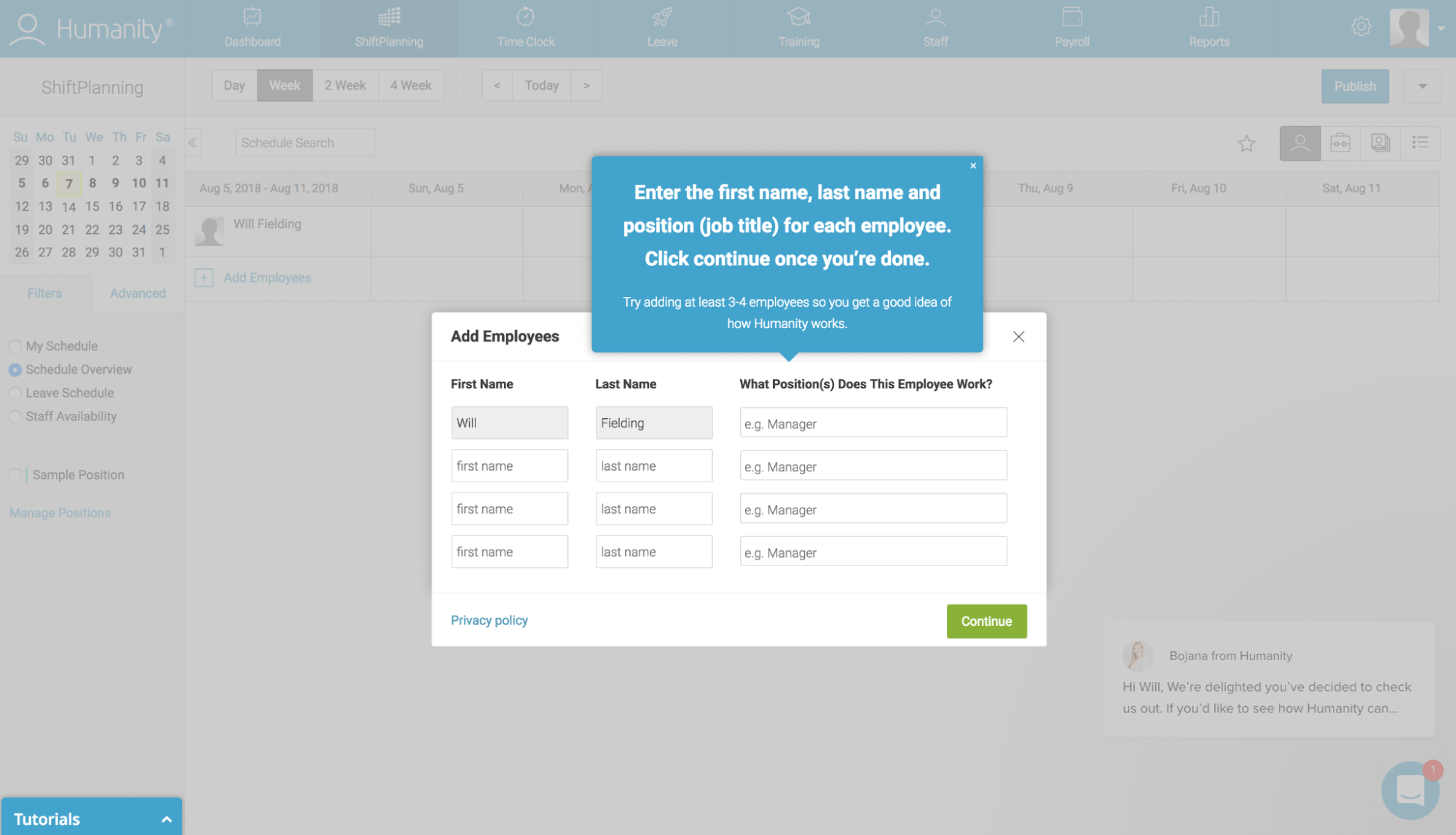
Users are then asked to enter a few employees’ names.
What makes tooltips effective is that they’re triggered one at a time, so there’s little risk of overloading your users. Tooltips also let users go at their own pace.
Interactive walkthrough best practices:
- Focus on one action at a time: Keep things simple. If you ask users to perform too many actions at once, you may end up confusing or overwhelming them.
- Allow users to skip the walkthrough: Some users may already be familiar with your product. Include an option to skip interactive prompts at any time.
7. Include checklists or progress bars
People generally loathe having checklists with incomplete tasks. This is because of the Zeigarnik effect, a phenomenon that explains our tendency to remember unfinished tasks over finished tasks.
Including a checklist or progress bar taps into this powerful principle, as it can motivate your users to complete the items by helping them keep track of their progress.
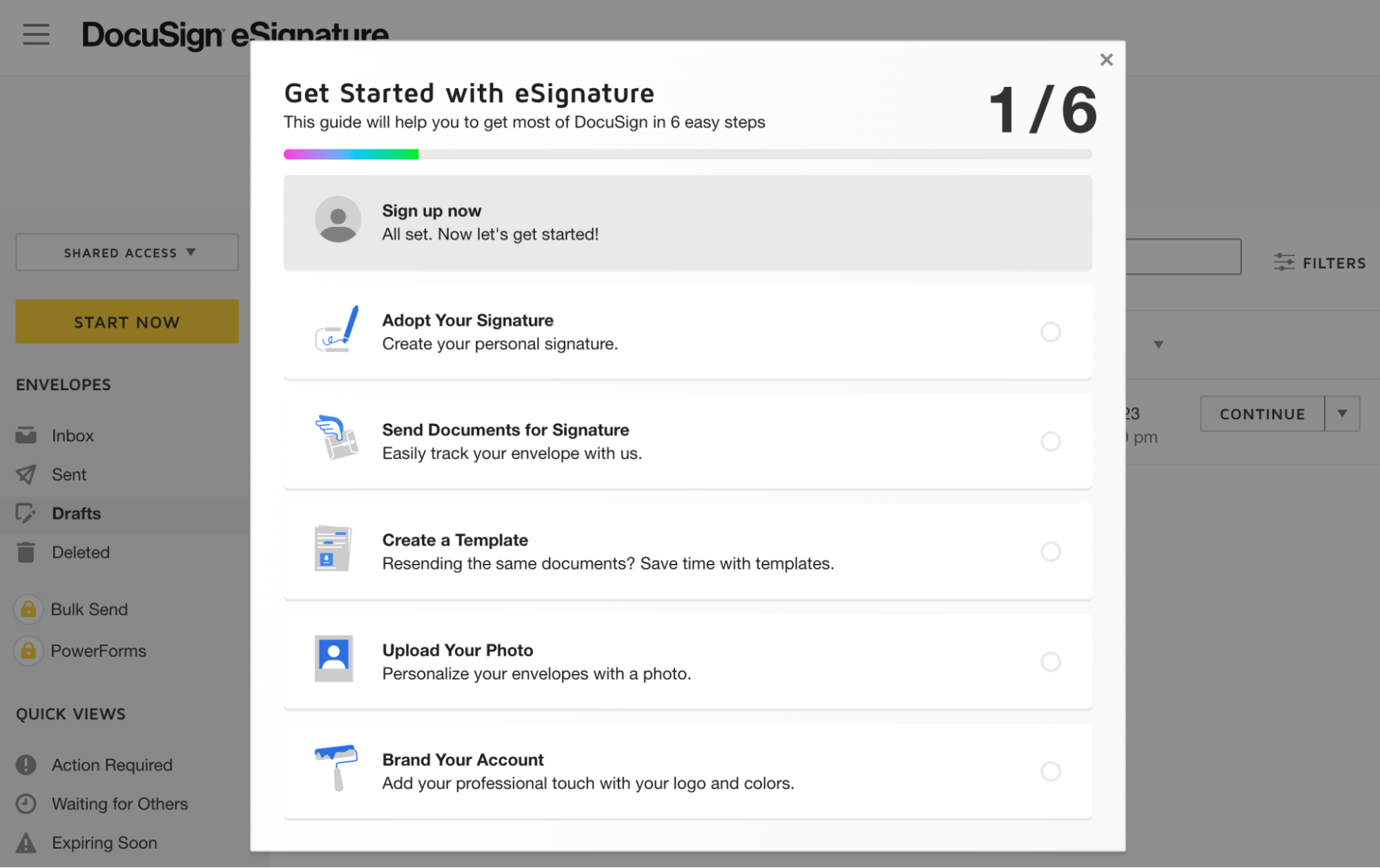
As an example, DocuSign presents new users with a checklist that contains six items. There’s also a progress bar at the top of the window.
The first item is already checked off. All that’s left is for the user to finish the onboarding process by completing the other steps.
Progress bar best practices:
- Keep your checklists short: A laundry list of items will often overwhelm your users and may even cause them to quit halfway through.
- Tie each item to an “aha” moment: Reduce churn by creating a checklist that guides users to those crucial “aha” moments.
8. Send follow-up emails with helpful tips
86% of buyers are more likely to stay with companies that provide ongoing onboarding resources. To increase retention, send periodic emails to help your users get the most out of your products.
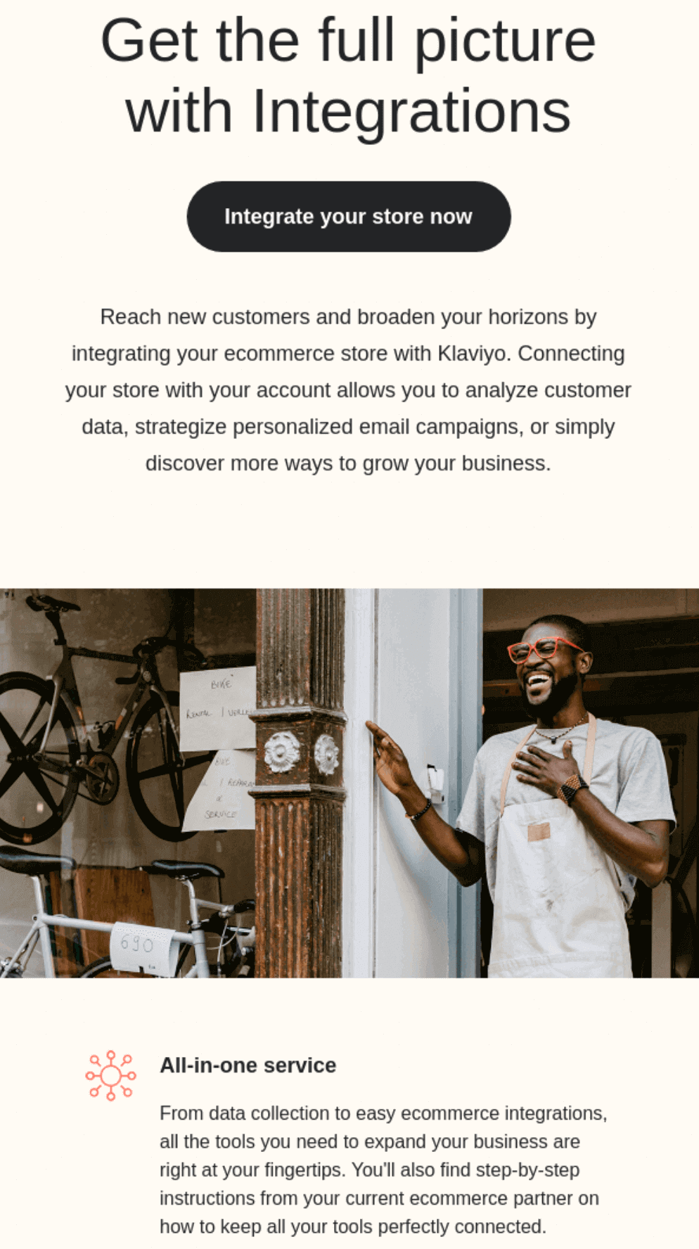
Here’s an example of a follow-up email that Klaviyo, a marketing automation platform, sends to new users:
The email goes on to explain how users can reach new buyers by integrating their eCommerce store with the platform. It also includes a clear CTA for users to get started right away.
Follow-up email best practices:
- Be helpful: Always focus on providing value with your follow-up emails. Trying to push an upgrade can turn new users off.
- Keep it short: Your buyers lead busy lives. Be sure to keep your emails relatively short and focused on just one helpful tip.
9. Provide self-service options
New users will likely have questions about your product. But rather than reaching out to a customer success representative, most users prefer to troubleshoot problems on their own. In fact, 81% of consumers expect brands to offer more self-service options.
Offer plenty of self-service options that users can turn to if they encounter a problem. Common examples include:
- Knowledge bases
- FAQ pages
- Community forums
- Chatbots
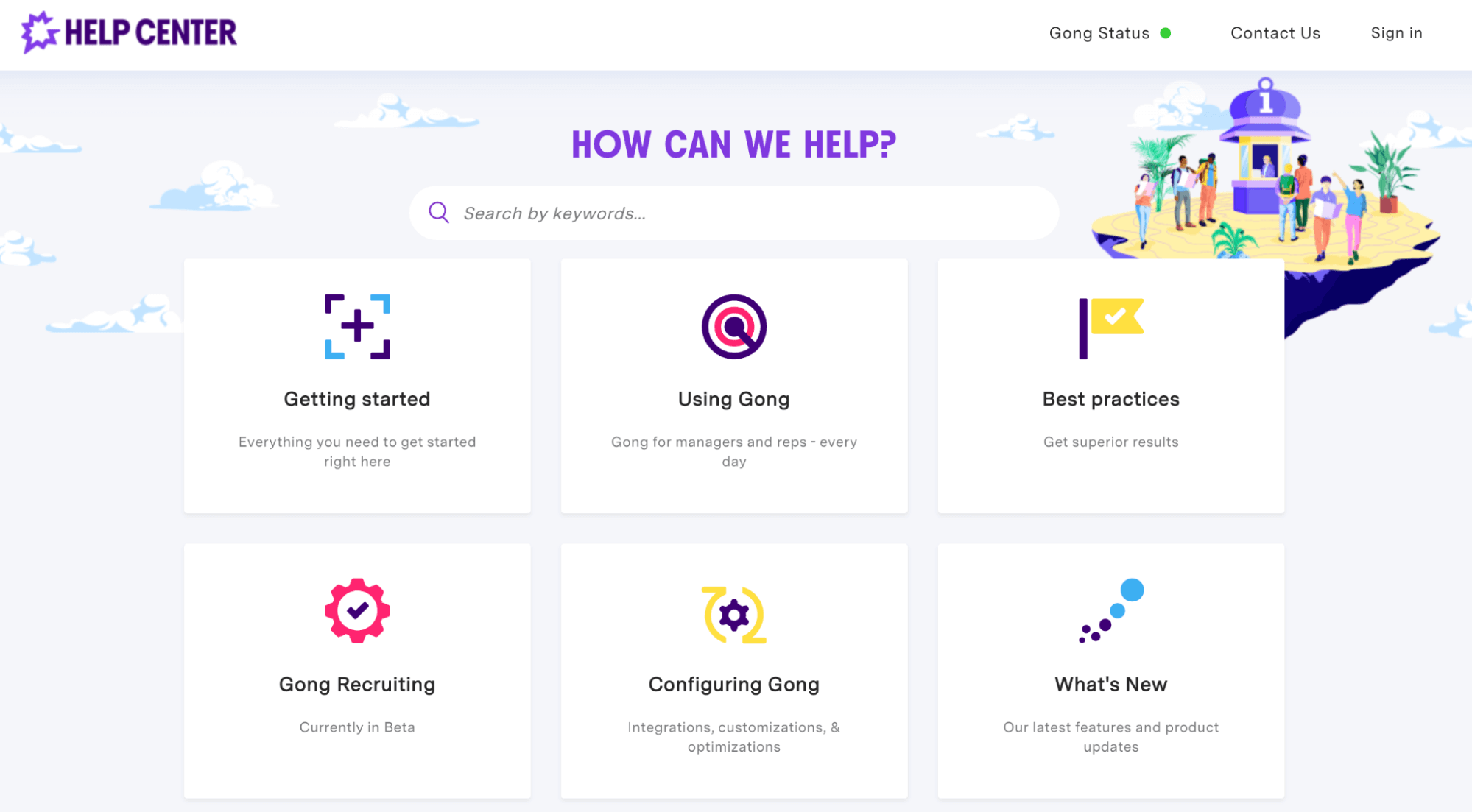
Here’s an example of our help center that our buyers can use to navigate our platform:
With self-service options, users can get the support they need without having to wait to speak to a customer success representative. They can also lower buyer support costs by reducing the amount of time reps spend answering the same queries.
Buyer self-service best practices:
- Highlight common issues: What are some of the top issues that your buyers are experiencing? Be sure to make those FAQs front and center.
- Provide live support options: Sometimes, users have unique issues that they can’t easily solve on their own. Give buyers the option to connect to a live agent.
10. Test and iterate your onboarding process
Always look for ways to improve your onboarding process.
Consider sending exit surveys to buyers who canceled their subscriptions. Not everyone will reply, but some may be more than happy to share their thoughts.
If users aren’t getting to those “aha” moments, it’s your job to find out why. Dig into your user behavior analytics data and come up with experiments. Examples include offering interactive walkthroughs or more personalized onboarding journeys.
Be sure to continually seek and incorporate feedback from your users. Even small changes can lead to profound results in terms of engagement.
Onboarding testing and iterating best practices:
- Test one element at a time: You may have a hundred ideas to help your users get to their “aha” moments. But it’s important to test one element at a time. If you make too many changes to your onboarding process, you won’t know which one led to higher engagement rates.
- Involve your customer success team: What suggestions do your customer success team have to help users achieve their short and long-term goals? Implement and test these suggestions to improve your onboarding process.
Add more users to your onboarding process
A proper onboarding experience can make all the difference when it comes to user retention. Follow the customer onboarding best practices laid out here to increase engagement and reduce churn.
Want to drive more buyers to your onboarding?
Book a demo today to see how our customer success software can help transform your sales process. Identify at-risk accounts, create a winning playbook, and get actionable insights that drive next steps.
